Wednesday 30 November 2011

Kindle eReader: tool or toy?

Curiosity finally got the better of me, and I am now the owner of an Amazon Kindle eReader - the version with a keyboard, Wi-fi and 3G Internet access.

First impressions

I don't want to go through all the features - there are plenty of technical websites that do that (including Amazon's own website). I will focus on two aspects. Firstly, what have I noticed about its usability in practice over the first few days? And secondly, how useful will it be for me as a translator?

Let's start with a couple of negative points. Although the text is crisply defined and can quickly be adjusted to different sizes, the background is rather grey. I knew in advance that the Kindle screen is not "backlit", so it needs daylight or artificial light to read. But comparisons with the legibility of text on paper are only partly true, because the background is darker than paper. Reading it in a dimly lit room is rather difficult, so you need a reading light or a clip-on battery light. With the right lighting, however, it is easy and pleasant to read.

Turning the pages of a book is easy and quick, especially compared with printed books. In other respects, however, navigation is slightly clunky and takes some getting used to. There is no mouse or touchpad, and this Kindle doesn't have a touchscreen. To move around on the page, there are 4 tiny little arrow keys, and to move to a word in the middle of the page you have to press the down and left/right keys several times. I suppose I am spoiled by my other equipment: desktop PC with a mouse, laptop/netbook with a trackpad or mouse, smartphone with a touchscreen. So my first impression of the Kindle keyboard is rather like time travel - as if I were moving back to a slightly older technology.

Some of the ebooks that I have downloaded are even more difficult to navigate. One of the things I want to do with the Kindle is to read the Bible. I have checked a number of Bibles in both English and German, and incredibly I find that many of them have no table of contents at all. The Bible is not the sort of book that you read sequentially from front to back, so a table of contents is essential. I have found one or two that I can use, but the selection of properly indexed Bibles is very small indeed.

One feature of this Kindle is the free Internet access over the 3G network in all of the countries that I am likely to travel to. This feature is mainly designed to let me access the Amazon store when I am on the road, but the Kindle also has a rudimentary browser (which Amazon calls "experimental"). I have tried it, and I am really able to access my own e-mail account with this browser. But operating a browser with only arrow keys and no mouse feels rather clumsy. It is easier, faster and more pleasant to check e-mails and the Internet with my smartphone, in spite of the smaller screen. So I will hardly use the "experimental" browser in Germany, where I have an Internet flatrate on the smartphone. But it will be useful, for example, when I visit the UK and am not within reach of a Wi-fi access point.

Kindle for translators?

On my Kindle I have three free monolingual dictionaries (Oxford Dictionary of English, New Oxford American Dictionary and Duden Universalwörterbuch). Here, the indexing is excellent. I can choose one of them as my default dictionary, and when I am reading on the Kindle I can look words up directly from the text. Or I can open one of them from the menu and search in the dictionary, and even turn the pages to check out entries before and after the keyword I have entered. A couple of times during the last few days I have used these dictionaries to check terms in both German and English in the course of my work. I will probably also download a thesaurus for English, and one for German, too.

Amazon's Kindle shop offers various bilingual dictionaries, although most of them seem to be targeted at general users rather than professional translators. There may be some specialist dictionaries worth buying - for example I am currently checking the free sample of an illustrated bilingual engineering dictionary. The Kindle Shop could also be a useful source of monolingual specialist literature. There are dictionaries in either language for subjects such as law, property/construction and many others. It also offers the text of German laws for a very moderate price.

Another feature of the Kindle is that I can send my own documents to it in various file formats. This could be useful for anything I need to refer to during my work (source documents, abbreviation lists, background texts etc.). To test this function, I sent the DVX2 manual to my Kindle. It is a PDF file which is over 600 pages long, and the table of contents is not indexed for the Kindle, so navigation is limited. But I entered the search term "DeepMiner", and it jumped through the manual from one instance to another until it found the section that actually explains how this function works. I was then able to rotate the screen to wide format and adjust the size so that I could read it reasonably well. The display is not in colour, and navigation is more clumsy than on a desktop or laptop computer, but for some purposes this function could be useful.

The classic use for the Kindle, of course, is to read books from start to finish. This works well, and it is convenient to have a selection of books in just one relatively lightweight device which claims to be able to store 3,000 books or more (especially when travelling). Only time will tell whether I use my Kindle mainly for leisure reading purposes, or whether it really becomes a regular part of my workflow.

Friday 11 November 2011

DVX2 screenshot gallery

At first sight, the screen of the Translation Memory program DéjàVuX2 (DVX2) is just a mass of boxes, a chaotic pattern of vertical and horizontal lines. What are they all for? Where in this enormous jigsaw puzzle can I find the text I want to translate? What other information is provided on the screen, and how is it helpful? The best way to explore this is with screenshots.

The classic layout
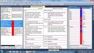
When you start working on a project with DVX2, the screen will probably look something like this. The pane at the top left is the working area. The left column is headed "German" - that is my source language. The right column, English (United Kingdom), is where my translation goes.

At the bottom left and bottom right of the screen I can see my reference material. At the bottom right I have terminology suggestions ("AutoSearch Portions"), and at the bottom left I have similar sentences ("AutoSearch Segments"). The top right ("Project Explorer") shows me the files in the project. When I am working on the translation, I normally hide this pane so that I have the full window height for the terminology.
There are various ways to personalise this layout. I can change the font and type size in the various windows, and I can also change the arrangement of the different panes in the working window.
My personal layout
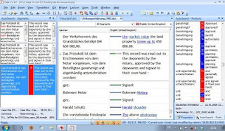
Modern monitors, laptops and netbooks tend to have a wide screen. There is not much space to display elements above each other, so it is sometimes better to display the elements side by side. Therefore, my normal DVX2 screen looks like this:
In this "tramline" layout, the working area is in the middle of the screen and the reference material is arranged to the right and left. It provides more context (i.e. the text before and after the active sentence). The shorter lines could be a disadvantage for longer sentences, and especially on smaller screens. The above screenshot is taken from my 22" monitor. On my 10" netbook, this layout is rather more cramped, although it would be just about workable:
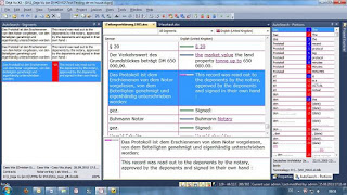
One way to make the lines longer in the working area is to work in a separate text area at the bottom of the screen and to split this text area vertically (Tools>Options>Environment). The active sentence is highlighted in the grid, but the working area is now at the bottom, i.e.:
I often get jobs with very long sentences, and sometimes the reference pane on the left is empty for most segments. In such jobs, I can simply hide this column, which gives me longer text lines even without using the separate text area:
Hide and display
In the last screenshot, note the little tabs on the left and right of the screen. They are "mouse-over" tabs. If I want to have a quick look at "AutoSearch Segments", I simply move the mouse over the tab, and the AS Segments pane opens up, but closes again when I return the mouse to the main grid.
Note also the little drawing pin icon at the top right of the "AS Portions" pane. This is a three-way switch for the display of this pane. It can either be fully displayed, as it is here, folded away like the "AS Segments" pane, or it can hover as in the mouse-over function. The combination of the tabs and the drawing pin icons takes a bit of practice, but it helps me to be flexible in using the screen layout.
Smaller details
There are a number of smaller details in the screen layout which can be useful.
The top of the DVX2 window shows the name and path of the current project. For example, the project I used for these screenshots is on drive D at the location shown.
These six icons are in the middle of the bottom edge of the DVX window. Mousing over them displays what they mean - here I had the mouse over the first icon (AutoWrite). The background colour shows me whether the function is on or off. Here, for example, AutoWrite, AutoAssemble, AutoPropagate and AutoCheck are enabled, but AutoSearch and AutoSend are disabled. These functions can also be switched on or off via Tools>Options>Environment, but the icons are quicker.

This is the area above the working part of the grid, and it contains a few hidden details. The grid language heading boxes (here "German" and "English") switch between alphabetical and chronological view of the project sentences. The language field with the flag has a little arrow to the right, which leads to a list of the target languages in the project (useful for project managers, but not usually for freelancers like me). The box "All segments" also has a little arrow, which opens up a list of types of sentence (all fuzzy matches, all exact matches etc.). The empty box on the left is a row finder. If I know the number of a segment, I can type it here, and DVX2 jumps to that segment (useful if I am proofreading and notice that a segment needs more work when I have finished proofing - I simply jot down the number and jump to the segment afterwards).
The tabs above this row show the name of the files which I have opened, so I can move to another file simply by clicking the tab. That in itself does not sound special. But these tabs can also be used to display files side by side (or one above the other). I can then compare my work on two files in context, for example like this:
This article only looks at the main grid, in other words the screen which I usually see when I work on a project. It does not explore the menu or any of the subsidiary screens, nor does it examine the efficiency of the many functions of the program. But I hope that this visual summary gives a general impression of the working environment.