At first sight, the screen of the Translation Memory program DéjàVuX2 (DVX2) is just a mass of boxes, a chaotic pattern of vertical and horizontal lines. What are they all for? Where in this enormous jigsaw puzzle can I find the text I want to translate? What other information is provided on the screen, and how is it helpful? The best way to explore this is with screenshots.
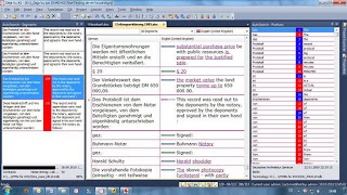
When you start working on a project with DVX2, the screen will probably look something like this. The pane at the top left is the working area. The left column is headed "German" - that is my source language. The right column, English (United Kingdom), is where my translation goes.
At the bottom left and bottom right of the screen I can see my reference material. At the bottom right I have terminology suggestions ("AutoSearch Portions"), and at the bottom left I have similar sentences ("AutoSearch Segments"). The top right ("Project Explorer") shows me the files in the project. When I am working on the translation, I normally hide this pane so that I have the full window height for the terminology.
There are various ways to personalise this layout. I can change the font and type size in the various windows, and I can also change the arrangement of the different panes in the working window.
My personal layout
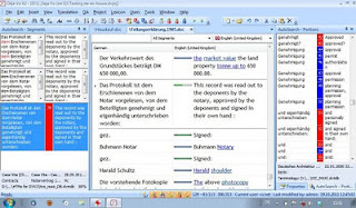
Modern monitors, laptops and netbooks tend to have a wide screen. There is not much space to display elements above each other, so it is sometimes better to display the elements side by side. Therefore, my normal DVX2 screen looks like this:
 In this "tramline" layout, the working area is in the middle of the screen and the reference material is arranged to the right and left. It provides more context (i.e. the text before and after the active sentence). The shorter lines could be a disadvantage for longer sentences, and especially on smaller screens. The above screenshot is taken from my 22" monitor. On my 10" netbook, this layout is rather more cramped, although it would be just about workable:
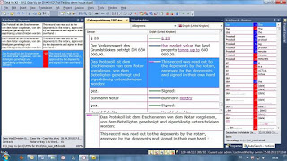
 One way to make the lines longer in the working area is to work in a separate text area at the bottom of the screen and to split this text area vertically (Tools>Options>Environment). The active sentence is highlighted in the grid, but the working area is now at the bottom, i.e.:
 I often get jobs with very long sentences, and sometimes the reference pane on the left is empty for most segments. In such jobs, I can simply hide this column, which gives me longer text lines even without using the separate text area:
Hide and display
In the last screenshot, note the little tabs on the left and right of the screen. They are "mouse-over" tabs. If I want to have a quick look at "AutoSearch Segments", I simply move the mouse over the tab, and the AS Segments pane opens up, but closes again when I return the mouse to the main grid.
Note also the little drawing pin icon at the top right of the "AS Portions" pane. This is a three-way switch for the display of this pane. It can either be fully displayed, as it is here, folded away like the "AS Segments" pane, or it can hover as in the mouse-over function. The combination of the tabs and the drawing pin icons takes a bit of practice, but it helps me to be flexible in using the screen layout.
Smaller details
There are a number of smaller details in the screen layout which can be useful.
 The top of the DVX2 window shows the name and path of the current project. For example, the project I used for these screenshots is on drive D at the location shown.
This is the area above the working part of the grid, and it contains a few hidden details. The grid language heading boxes (here "German" and "English") switch between alphabetical and chronological view of the project sentences. The language field with the flag has a little arrow to the right, which leads to a list of the target languages in the project (useful for project managers, but not usually for freelancers like me). The box "All segments" also has a little arrow, which opens up a list of types of sentence (all fuzzy matches, all exact matches etc.). The empty box on the left is a row finder. If I know the number of a segment, I can type it here, and DVX2 jumps to that segment (useful if I am proofreading and notice that a segment needs more work when I have finished proofing - I simply jot down the number and jump to the segment afterwards).
The tabs above this row show the name of the files which I have opened, so I can move to another file simply by clicking the tab. That in itself does not sound special. But these tabs can also be used to display files side by side (or one above the other). I can then compare my work on two files in context, for example like this:
This article only looks at the main grid, in other words the screen which I usually see when I work on a project. It does not explore the menu or any of the subsidiary screens, nor does it examine the efficiency of the many functions of the program. But I hope that this visual summary gives a general impression of the working environment.


Danke Victor. Eine sehr übersichtliche und hilfreiche Darstellung. Und wie man sieht, lernt man immer noch was hinzu. MfG Peter Spitz
ReplyDeleteDanke Peter. Auch ich bin ständig am Lernen. Bei DVX2 gibt es immer noch unerschlossene Bereiche. Na ja, lebenslanges Lernen ist ohnehin mein Schlagwort.
ReplyDelete